Team RoW Internal Branding
Role: Creative Direction and Design
Brand: Intuit Rest of World
Overview
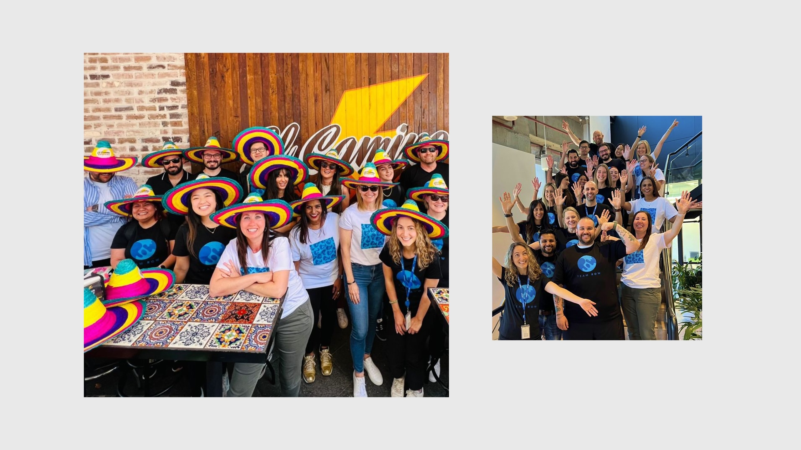
The Intuit Rest of World go-to-market (GTM) team had grown from a regional unit into a global operation of 200 marketers across multiple regions. As the team scaled, it needed a shared identity that would help people in different time zones and cultures feel part of one team.
Challenge
The GTM Director asked me to create a team brand that reflected the scale of the operation and brought the value of “stronger together” to life.
Overview
The Intuit Rest of World go-to-market (GTM) team had grown from a regional unit into a global operation of 200 marketers across multiple regions. As the team scaled, it needed a shared identity that would help people in different time zones and cultures feel part of one team.
Challenge
The GTM Director asked me to create a team brand that reflected the scale of the operation and brought the value of “stronger together” to life.
Overview
The Intuit Rest of World go-to-market (GTM) team had grown from a regional unit into a global operation of 200 marketers across multiple regions. As the team scaled, it needed a shared identity that would help people in different time zones and cultures feel part of one team.
Challenge
The GTM Director asked me to create a team brand that reflected the scale of the operation and brought the value of “stronger together” to life.
Overview
The Intuit Rest of World go-to-market (GTM) team had grown from a regional unit into a global operation of 200 marketers across multiple regions. As the team scaled, it needed a shared identity that would help people in different time zones and cultures feel part of one team.
Challenge
The GTM Director asked me to create a team brand that reflected the scale of the operation and brought the value of “stronger together” to life.
Overview
The Intuit Rest of World go-to-market (GTM) team had grown from a regional unit into a global operation of 200 marketers across multiple regions. As the team scaled, it needed a shared identity that would help people in different time zones and cultures feel part of one team.
Challenge
The GTM Director asked me to create a team brand that reflected the scale of the operation and brought the value of “stronger together” to life.
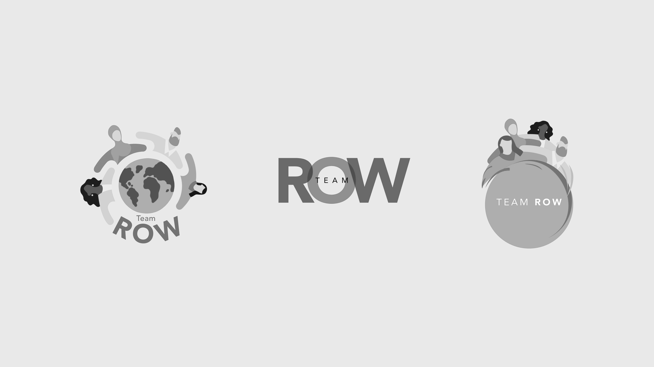
Exploration
I explored various design directions to see how we could convey a sense of scale and unity through visual and typographic treatments.
Exploration
I explored various design directions to see how we could convey a sense of scale and unity through visual and typographic treatments.
Exploration
I explored various design directions to see how we could convey a sense of scale and unity through visual and typographic treatments.
Exploration
I explored various design directions to see how we could convey a sense of scale and unity through visual and typographic treatments.
Exploration
I explored various design directions to see how we could convey a sense of scale and unity through visual and typographic treatments.
Intuit Rebrand
During the design process, Intuit announced its rebrand, which gave me the opportunity to change my direction to align with the new company brand identity.
Intuit Rebrand
During the design process, Intuit announced its rebrand, which gave me the opportunity to change my direction to align with the new company brand identity.
Intuit Rebrand
During the design process, Intuit announced its rebrand, which gave me the opportunity to change my direction to align with the new company brand identity.
Intuit Rebrand
During the design process, Intuit announced its rebrand, which gave me the opportunity to change my direction to align with the new company brand identity.
Intuit Rebrand
During the design process, Intuit announced its rebrand, which gave me the opportunity to change my direction to align with the new company brand identity.
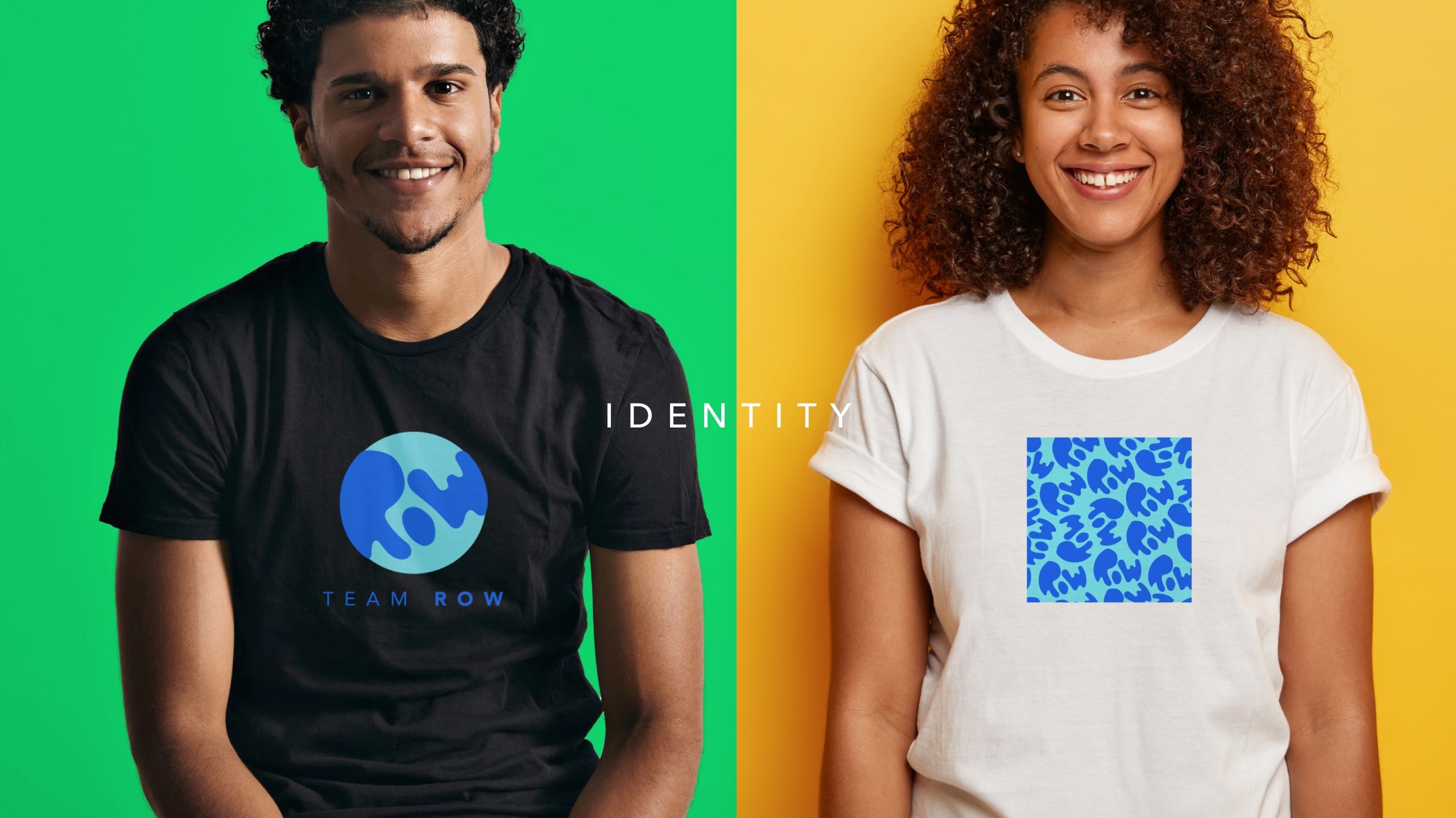
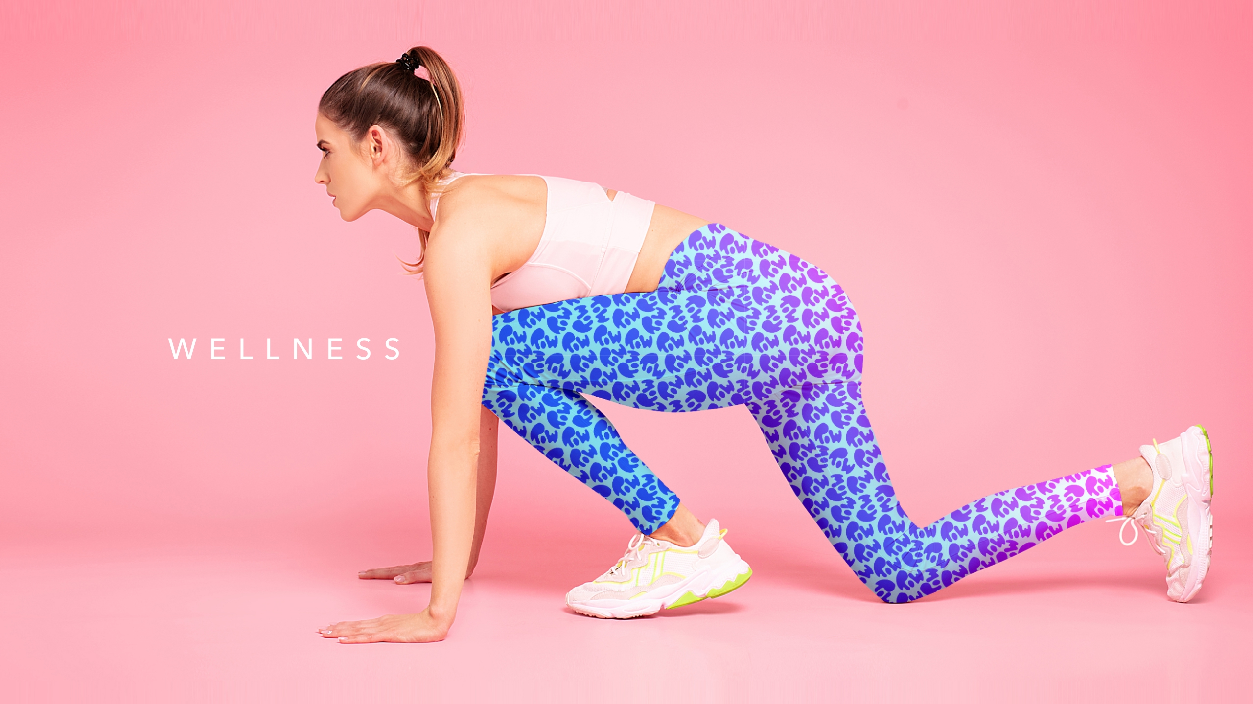
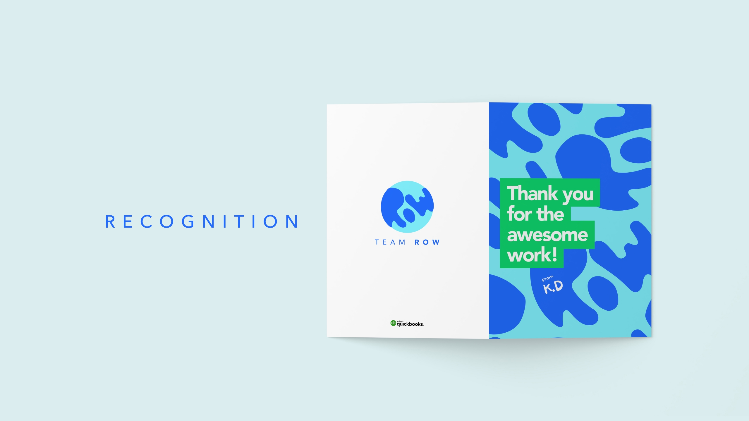
Final team logo
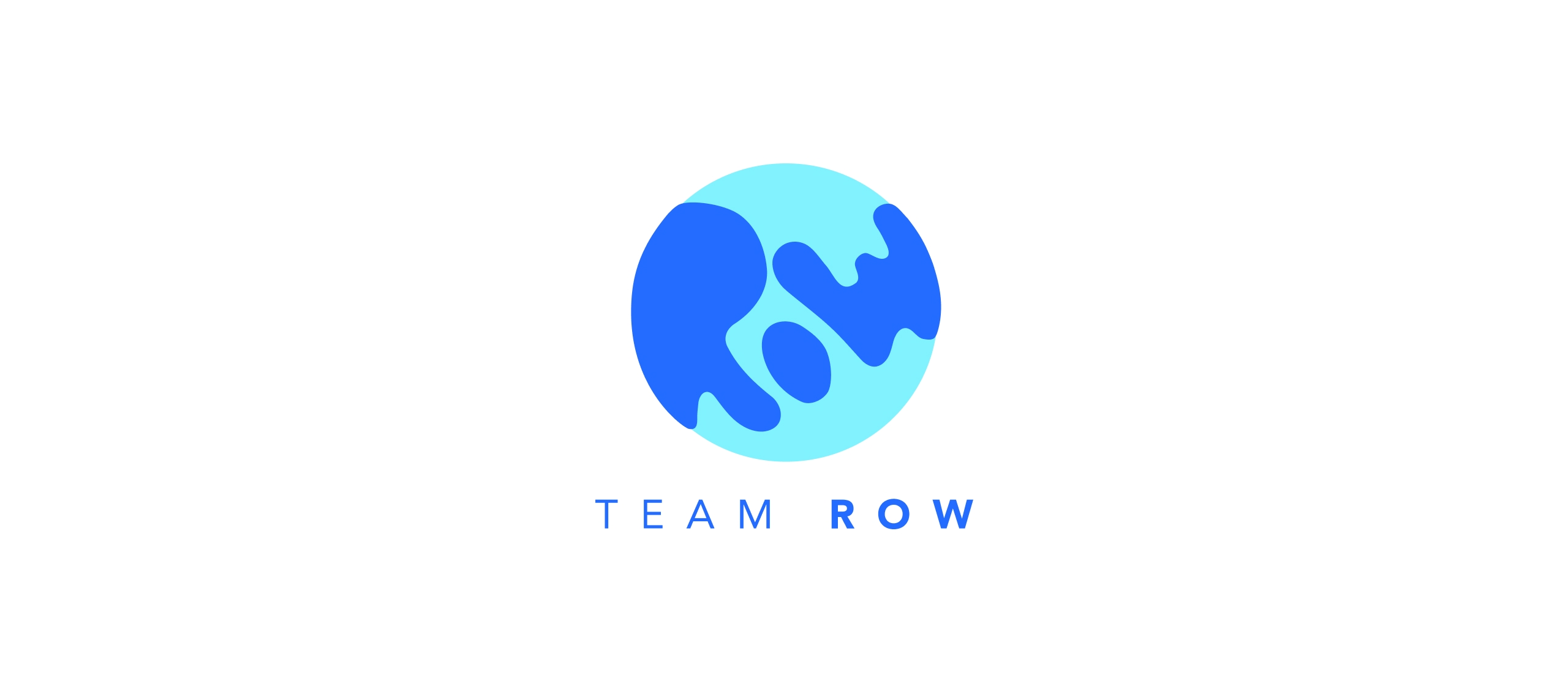
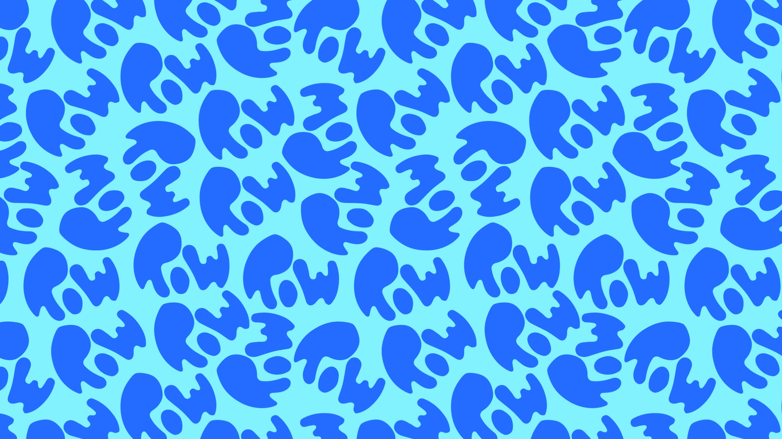
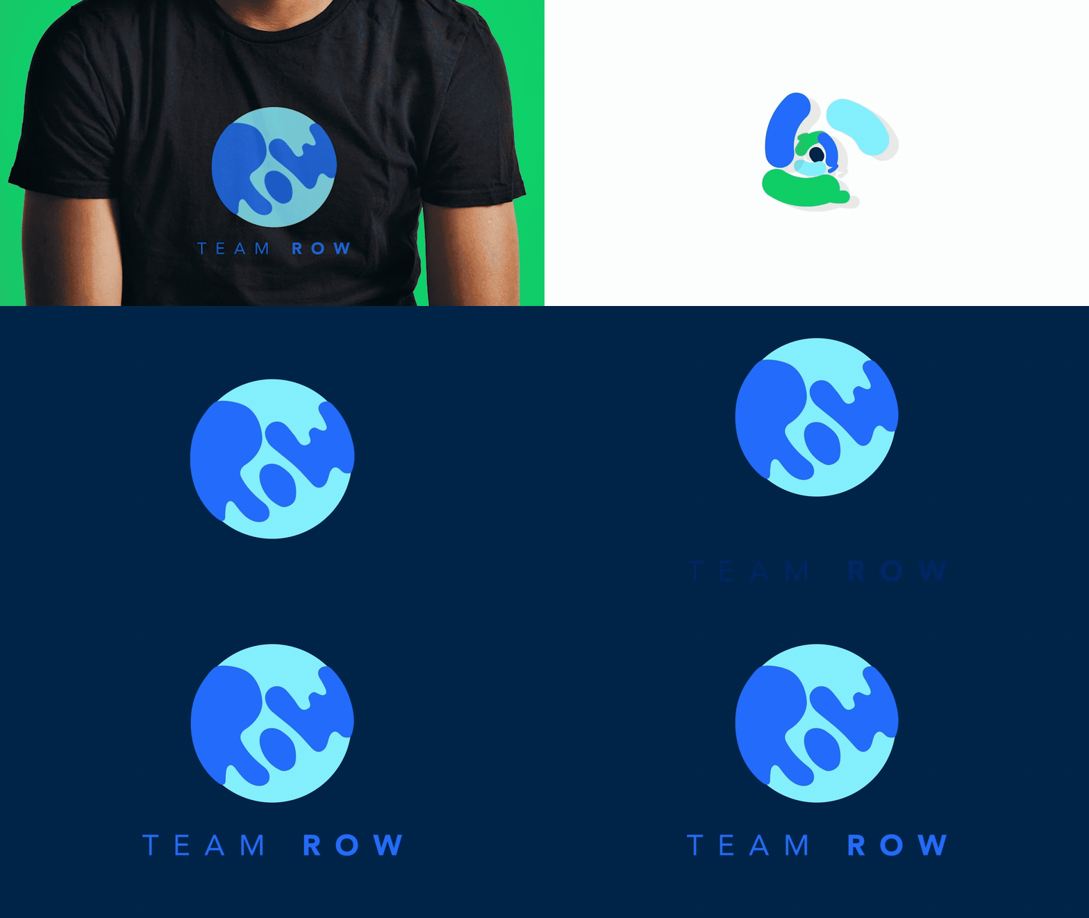
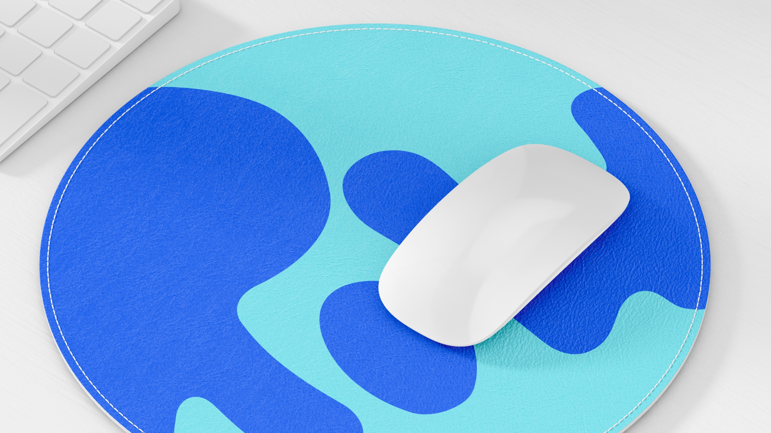
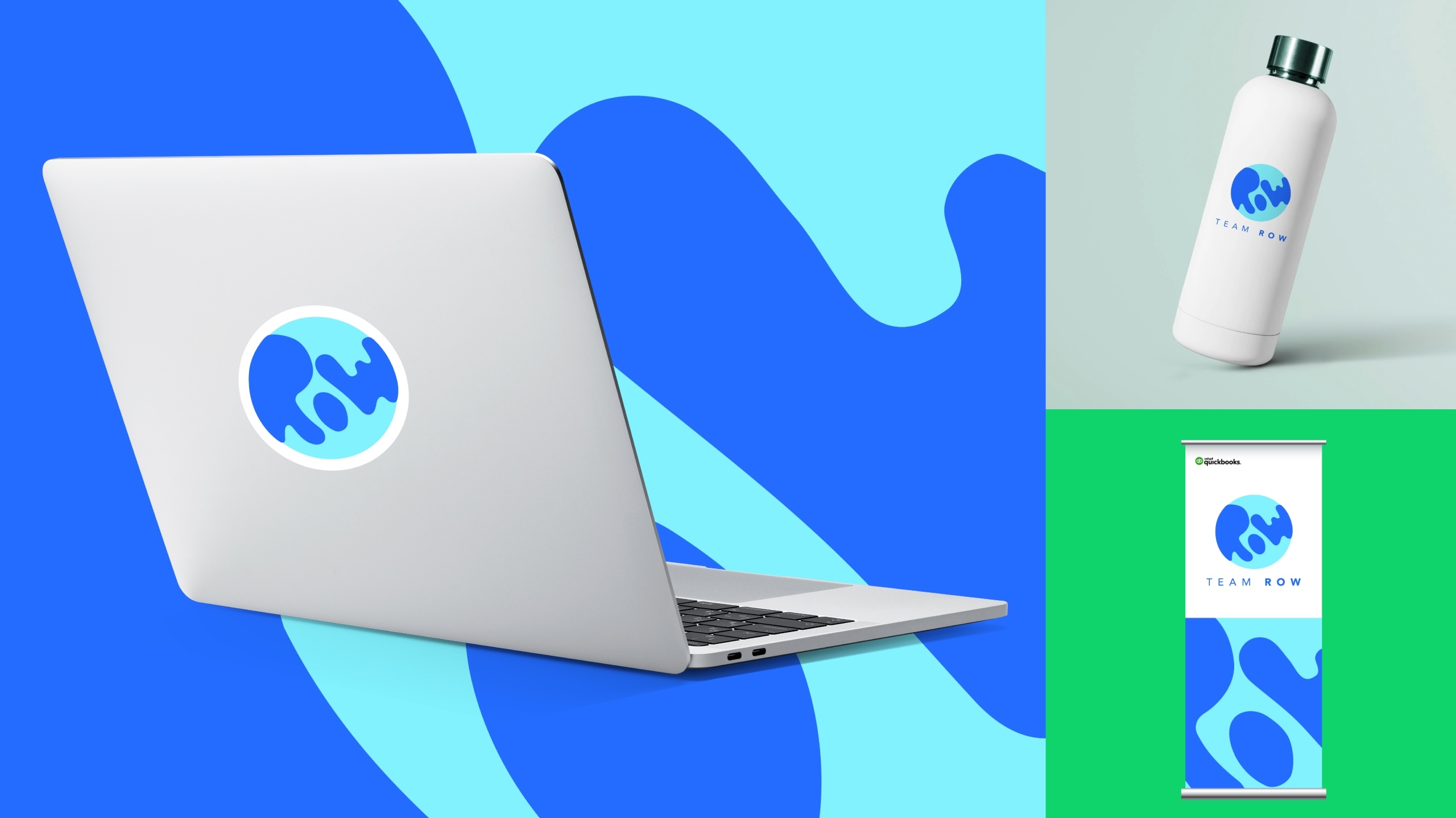
The final logo is fun and vibrant, and it conveys the scale at which the team operates. The letters R, O, and W are stylised into a map wrapping around a globe, highlighting the team’s regional operations.
Final team logo
The final logo is fun and vibrant, and it conveys the scale at which the team operates. The letters R, O, and W are stylised into a map wrapping around a globe, highlighting the team’s regional operations.
Final team logo
The final logo is fun and vibrant, and it conveys the scale at which the team operates. The letters R, O, and W are stylised into a map wrapping around a globe, highlighting the team’s regional operations.
Final team logo
The final logo is fun and vibrant, and it conveys the scale at which the team operates. The letters R, O, and W are stylised into a map wrapping around a globe, highlighting the team’s regional operations.
Final team logo
The final logo is fun and vibrant, and it conveys the scale at which the team operates. The letters R, O, and W are stylised into a map wrapping around a globe, highlighting the team’s regional operations.
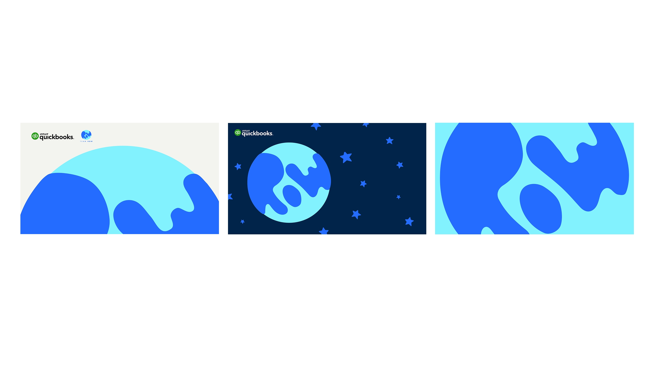
Lockups
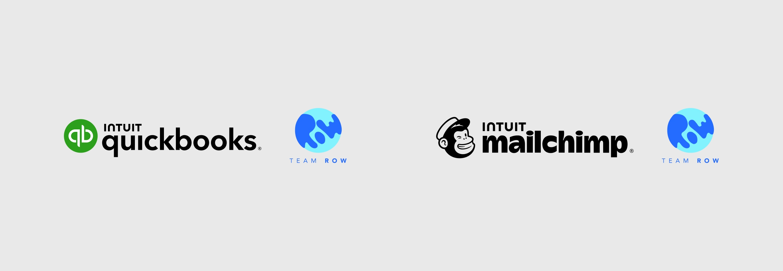
The team logo pairs with product logos to showcase operations across customer success, sales, and marketing.
Lockups
The team logo pairs with product logos to showcase operations across customer success, sales, and marketing.
Lockups
The team logo pairs with product logos to showcase operations across customer success, sales, and marketing.
Lockups
The team logo pairs with product logos to showcase operations across customer success, sales, and marketing.
Lockups
The team logo pairs with product logos to showcase operations across customer success, sales, and marketing.
Selected Works
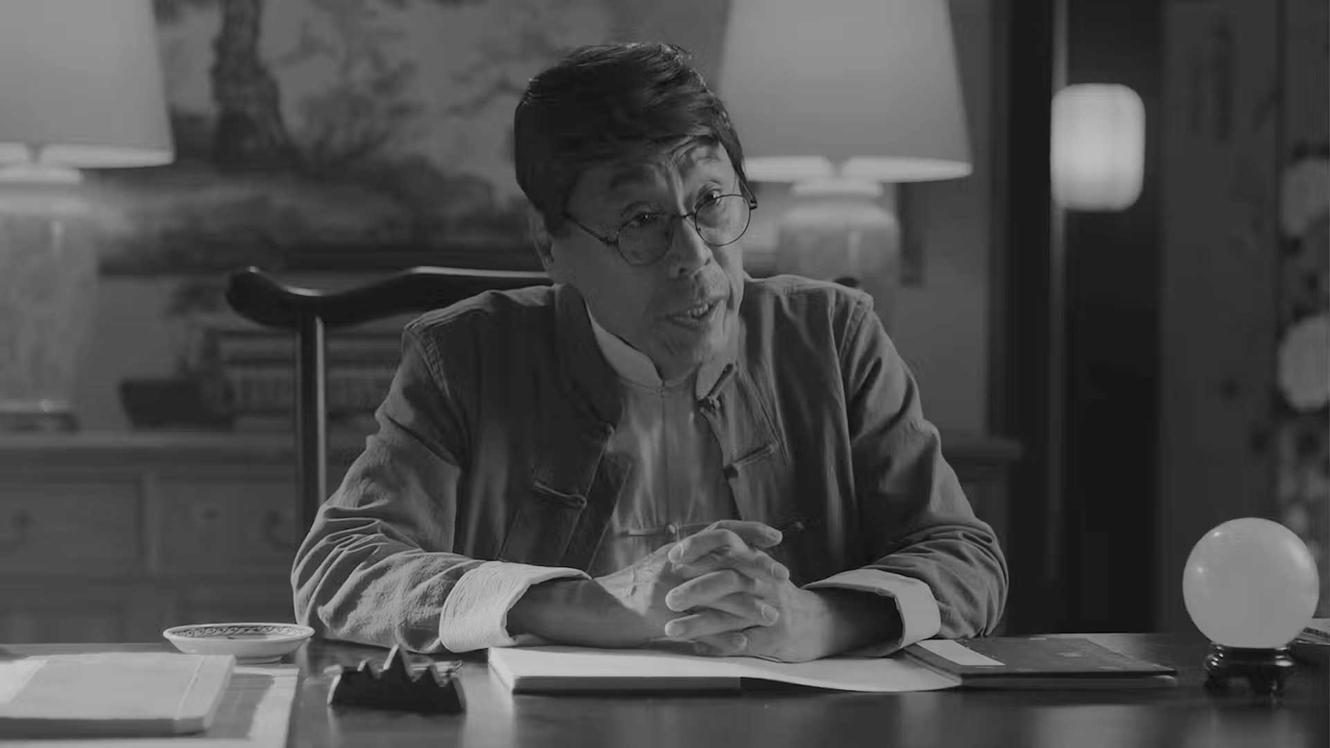
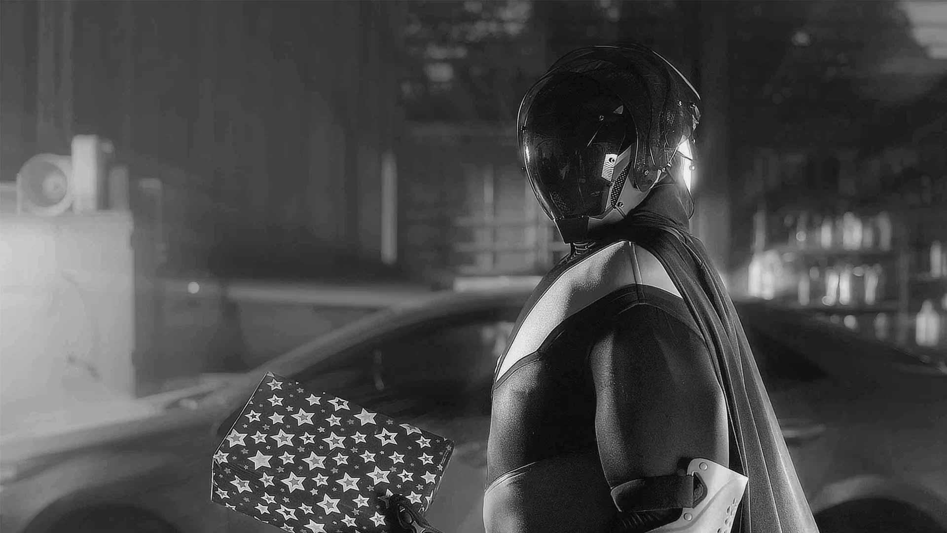
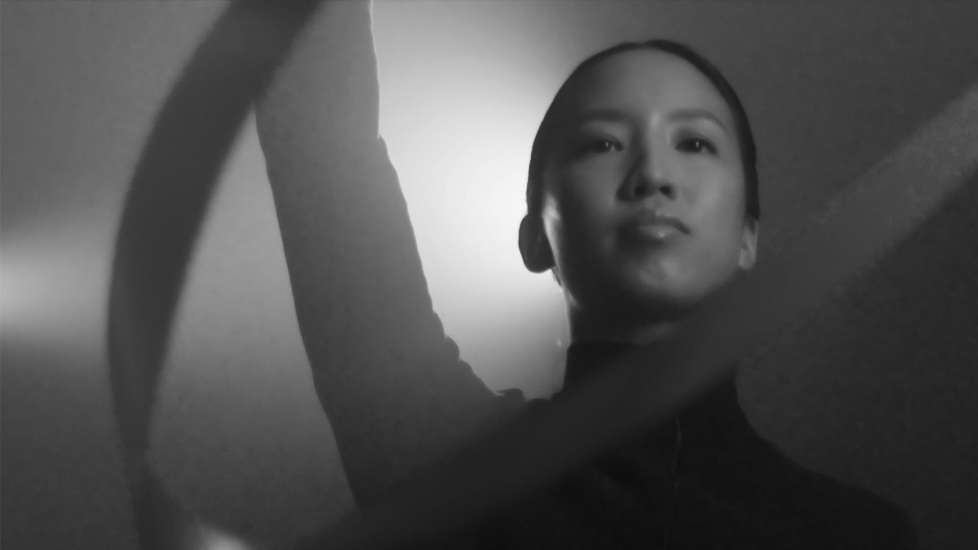
QuickBooks - Everyday HeroesCreative Direction

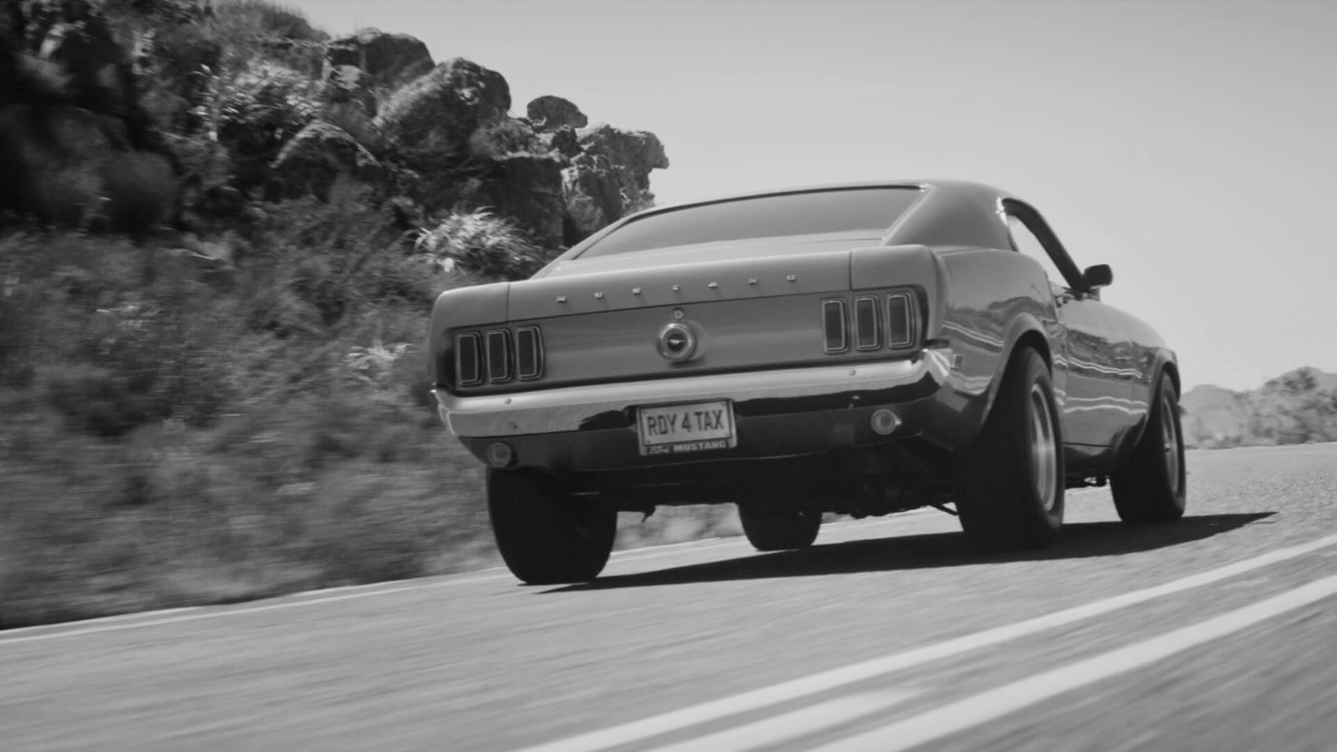
QuickBooks Customer-Led & UGC CampaignsCreative Direction
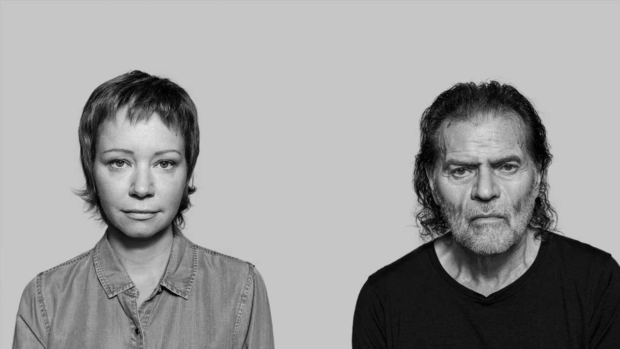
Garvan Disease DilemmasUX Design
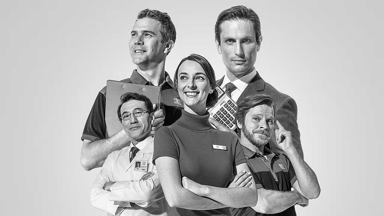
Lifetime of AdvantagesArt Direction
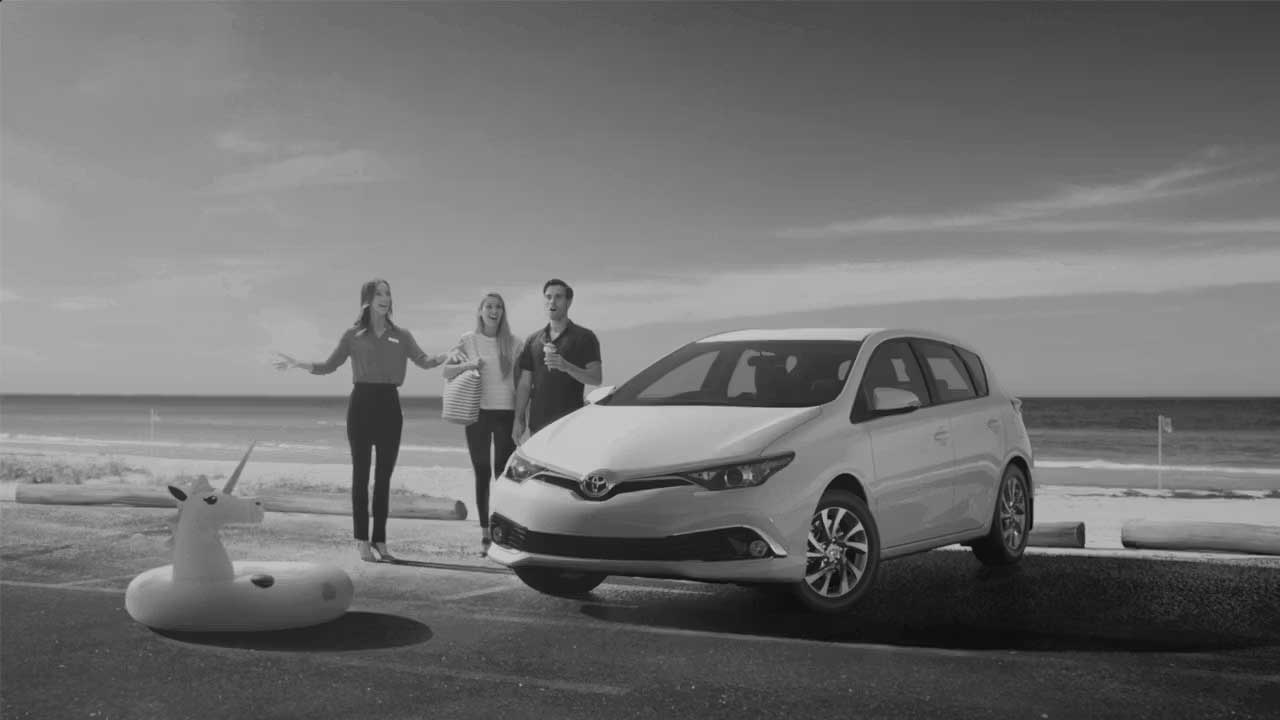
Toyota Retail CampaignsArt Direction
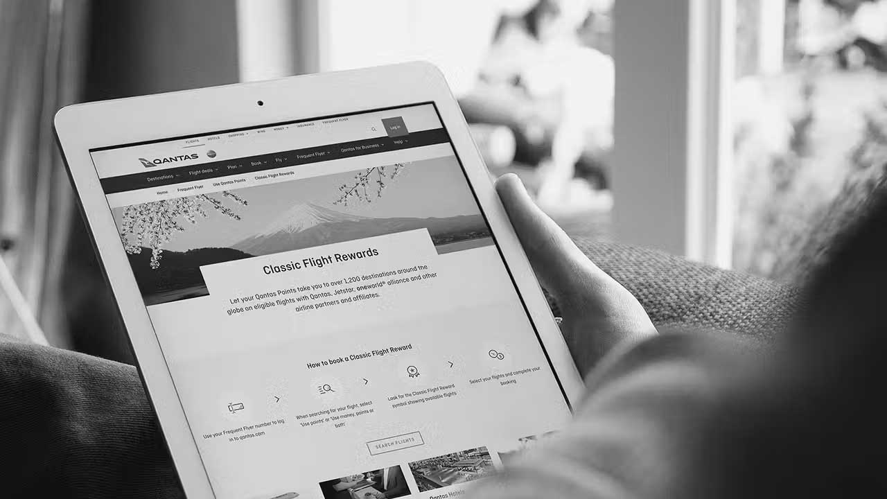
Qantas Frequent FlyerCampaign
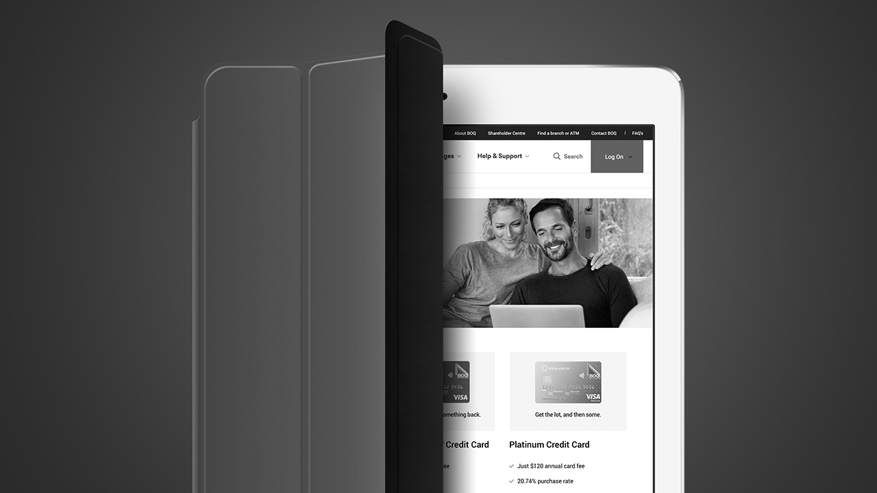
BOQ Credit Cards PlatformUX Design

Tea Drop Ecommerce SiteCreative Direction / UX and UI Design
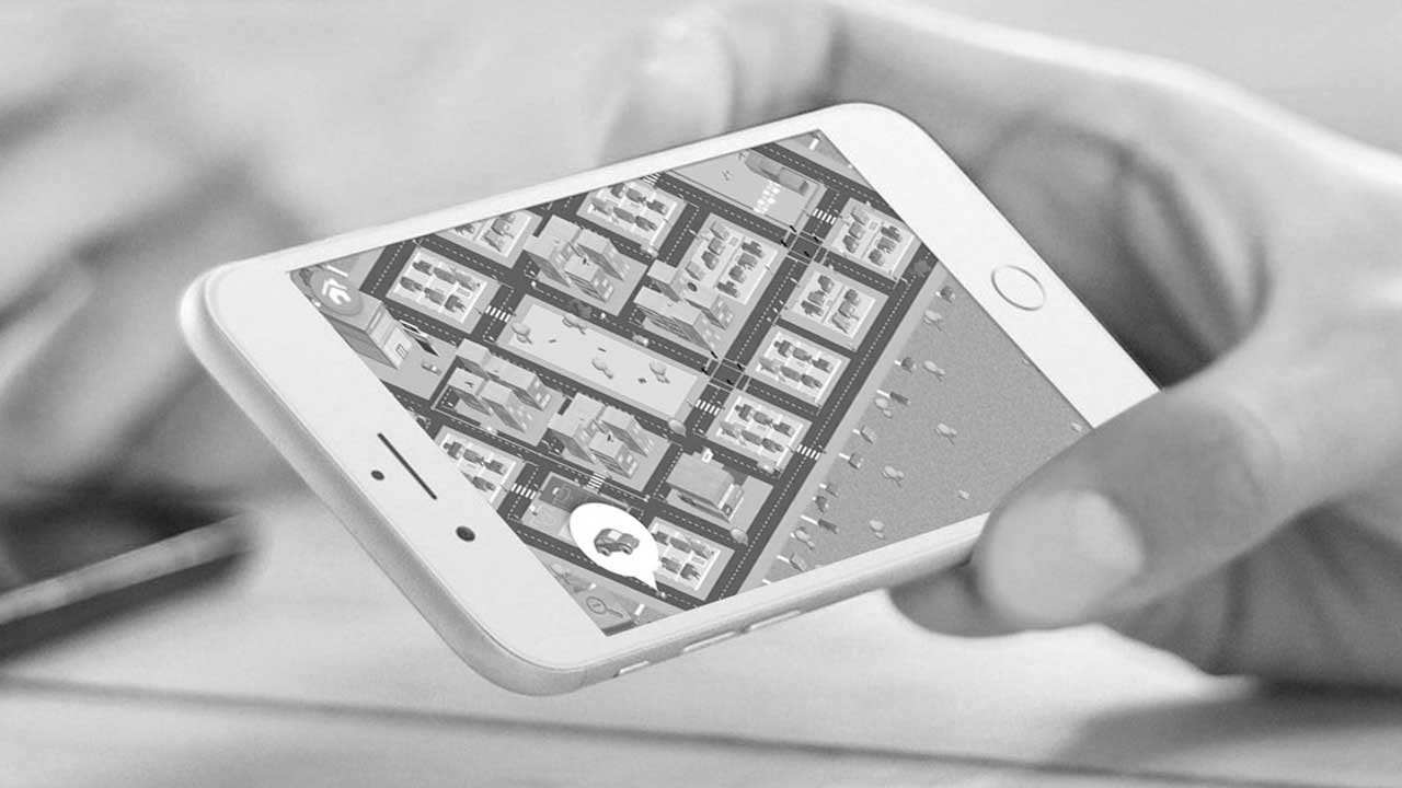
NRMA Road Smart Kids AppCreative Direction / UX and UI Design
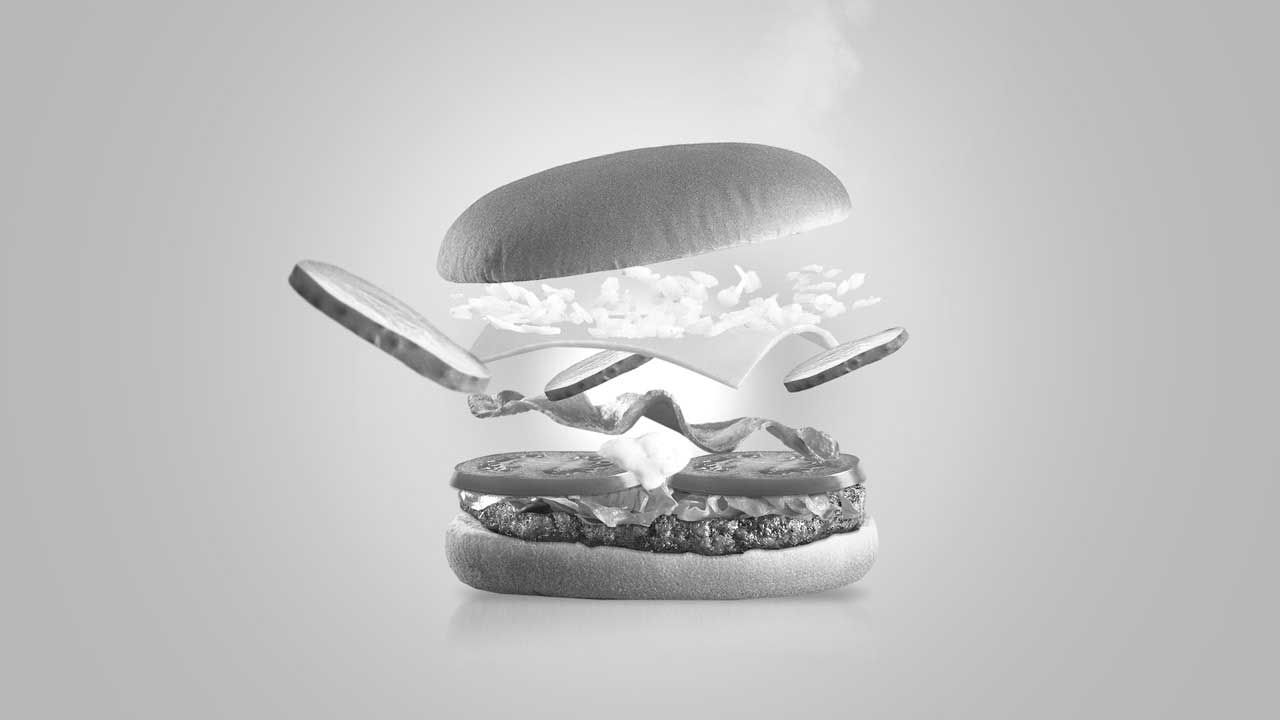
Maccas Build Our Next BurgerCreative Lead / Art Direction
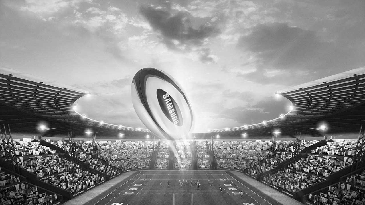
Samsung StadiumArt Direction / UX Lead
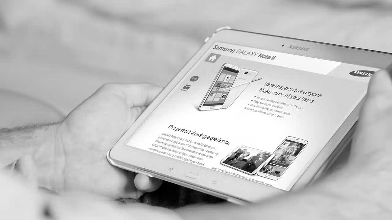
Samsung Experiene Store AppDesign Lead
BT Super VideosArt Direction
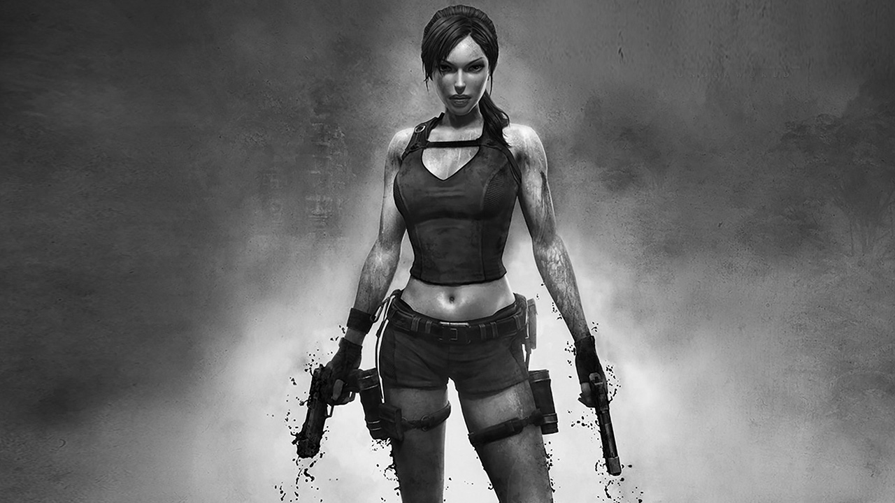
Atari Tomb Raider ChallengeDesign Lead