Qantas
Frequent Flyer
Role: UX Agency: BWM Isobar
Credit: CX Aaron Martin
Challenge
Despite being one of the most popular rewards programmes in Australia, the previous Qantas Frequent Flyer online platform was confusing and difficult to navigate. The ecosystem was heavily built around the business structure not their member needs. As a result, member activities declined and 63% of new joiners being active detractors. The task for BWM was to simplify and redesign an intuitive web experience that allows users easily understand the benefits and rewards of being a QFF member and encourage more member activities.

Solution
We shifted away from the previous structure of Flying/Non-Flying and introduced the new customer centric proposition of Earn Points/Use Points/Status & Tiers.
Results
Currently in market
The Process
1. Competitive Analysis
We looked at what our competitors and compatriots are doing to help us establish some guidelines around best and worst practice as relevant to our challenge.
2 Synthesise research data
We bought all the existing data within the organisation together and synthesised it as it was relevant to this challenge. This gave us a good understanding of the behaviours and barriers around the business challenge.
3. Personas
Using the the research data we already have and the knowledge from the QFF project team, we updated the existing 6 personas with additional 2 personas (new/unfamiliar users and prospects) to understand their needs and obstacles.
4. User Journeys
We analysed what we assumed in our user journeys against what the personas have told us.
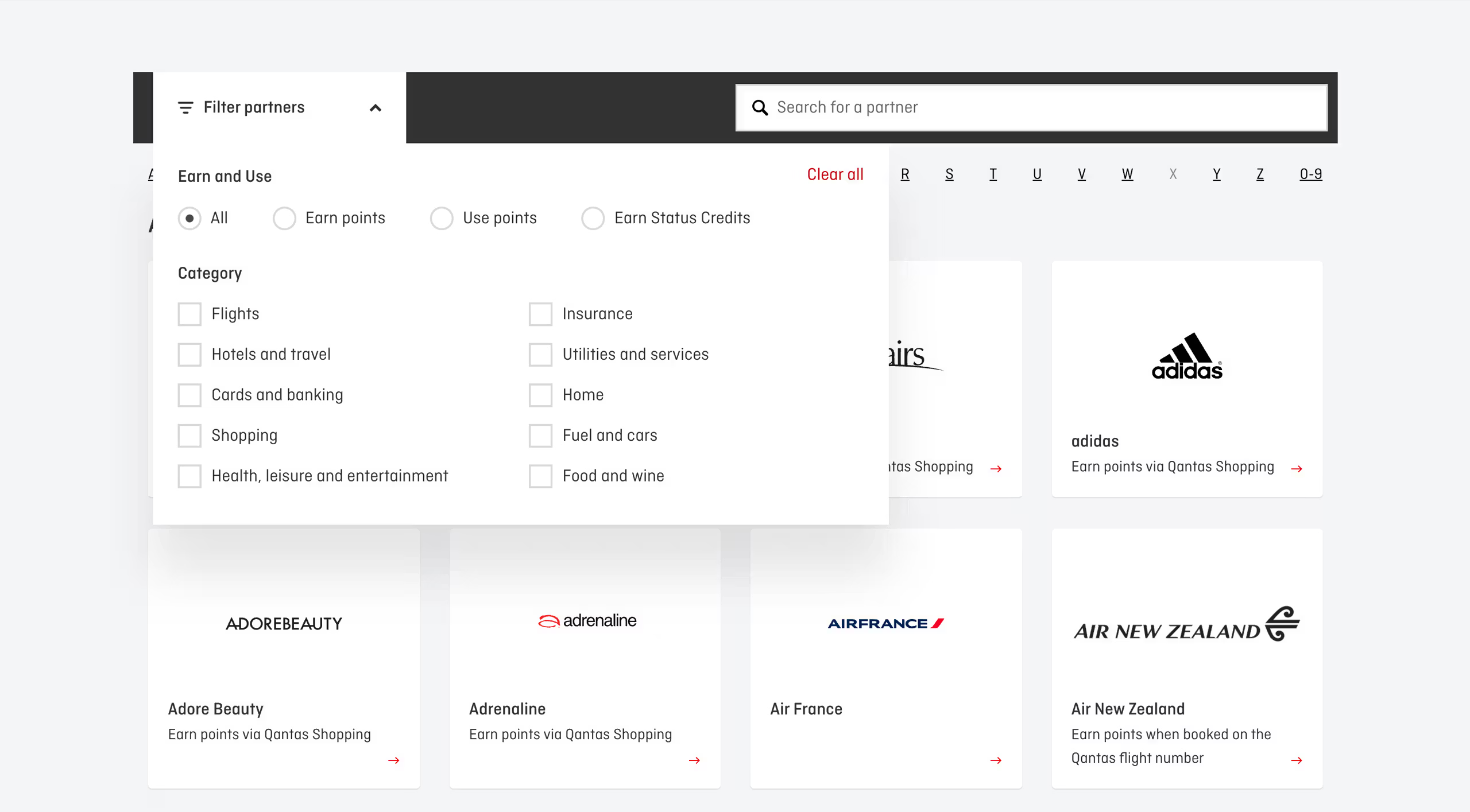
5. Partners Categories
The existing 8 categories for the points partners became less relevant as the program expanded into a wider area. Many of the miscellaneous partners were dumped into irrelevant categories. This led to the decision of reconstructing the categories.
6. Categorisation Review
We looked at a range of programs across a broad spread of industries to understand how they approached categorisation.
7. Card Sorting
50 Frequent Flyer members were invited to complete an Open Card sort. They were asked to place 35 business partners into categories of their definition.
8. Tree Testing
We tree tested our new options against the existing QFF categorisation to determine the most successful approach.
9. New IA
New IA was structured to shift the focus from business centric (flying and none flying) and became customer centric earn and burn proposition.
10. Wireframes
Clickable wireframes were created based on UX patterns and enabled changes in functionality and layout to flow through to other templates. From Earn, Spend to Status and Credit, one week cycle were given to complete each set before delivering to Qantas for UI design and development.
11 User Validation
6 Frequent Flyer Members residing in Australia were recruited to conduct a 45-minutes user testing session from a range of impression questions and also to complete some tasks on our low-fi prototypes created in Axure.
12. UI and Content
Content and UI design managed by Qantas in-house team.
New IA with customer centric earn and burn proposition

Redefined partners categories

New content structure effectively communicates how Qantas Points works and the benefits it comes with.


Selected Works

QuickBooks Everyday HeroesCreative Direction

Garvan Disease DilemmasUX Design

Toyota Retail CampaignsArt Direction

Lifetime of AdvantagesArt Direction

Tea Drop Ecommerce SiteCreative Direction / UX and UI Design

NRMA Road Smart Kids AppCreative Direction / UX and UI Design

Maccas Build Our Next BurgerCreative Lead / Art Direction

Samsung StadiumArt Direction / UX Lead

Samsung Experiene Store AppDesign Lead

Atari Tomb Raider ChallengeDesign Lead

BT Super VideosArt Direction